Index.
This brandbook outlines the core elements of Pearl Group's brand - covering our market positioning, personality, visual style, and tone of voice. It serves as a guideline in communicating who we are consistently. In that way, our brand stays strong, recognizable and true. By following these guidelines, you help to build and strengthen Pearl Group's brand.
Contact
If you have any questions or requests, please reach out to the project group.
Mission.
Pearl Group drives business growth and value creation by combining SAP solutions with forefront technology, local expertise and business understanding. We dedicate ourselves to taking your business to the next level.
Vision.
Our vision is to be the leading trusted SAP partner for North European businesses in delivering innovative solutions to boost operational excellence, growth, and customer experience.
Core Values.
Pearl Group’s core values Proactive, Solution Oriented, Enthusiastic and Collaborative are at the heart of everything we do. They unite us as a team and shape the meaningful results that we deliver for our customers. They guide our decisions, inspire our actions and unite us a group.
Proactive
We take initiative and stay ahead of the curve. Being proactive means identifying challenges and opportunities before they arise. By working closely with our customers, we anticipate their needs and deliver solutions that are one step ahead.
Solution Oriented
Thinking outside the box is part of who we are. This approach drives us to create innovative, effective solutions that help our customers succeed, no matter the complexity of the challenge.
Enthusiastic
Enthusiasm fuels our work and strengthens our relationships. We are passionate about what we do and bring that energy to every interaction – both with colleagues and customers. By fostering a fun and motivating workplace, we create an environment where creativity thrives.
Collaborative
We believe in leveraging our collective expertise in order to achieve more together. By sharing knowledge and building on each other’s strengths, we create solutions that are smarter and stronger.
Slogan
Our slogan Your Business. Next Level. is a guiding principle for our work and reflects how we position ourselves in the market. “Your Business” focuses on our customers, placing them in the center. “Next Level” reflects customer-centric focus, meaning we are a long-term partner who actively contributes to the scaling of our customers’ business.
Do:
→ When using the slogan, always write it exactly as shown. Each word must be capitalized and two dots included to preserve its intended format.
→ The font when using the slogan must always be Stolzl (not Stolzl Book)
Do not:
→ Do not use twist the slogan or create similar, for example "Your Cloud System. Next Level" or "Your Career. Next Level" are not allowed.

Accented dot.

The accented dot is a distinctive detail in our branding. It is only to be used for bold statements or for major headings in presentations. Use it sparingly.
Boilerplate
A boilerplate is a standard summary used across materials like press releases or presentations. It quickly explains who, what and why.
Pearl Group is a leading SAP partner in the Nordics, with 500+ consultants, specialists, developers and project managers. We specialize in SAP business systems, proprietary software and related technologies, offering deep expertise in these areas. Guided by our slogan "Your Business. Next Level.", Pearl emphasizes our role as a business partner, helping companies succeed in operations and information technology.
Our vision is to be the leading trusted SAP partner for North European businesses in delivering innovative solutions to boost operational excellence, growth, and customer experience. Our mission is to drive business growth and value creation by combining SAP solutions with forefront technology, local expertise and business understanding.
With remarkable growth in recent years, Pearl Group’s revenue increased from € 35 million in 2021 to € 54.3 million in 2022, € 60.2 million in 2023, and € 86 millon in 2024. We aim to reach € 101 million in revenue by 2025.
Brand Personality
Pearl Group’s core values are Solution Oriented, Enthusiastic, Proactive and Collaborative, which is the backbone of Pearl Group. These values shape our behavior and how we interact, communicate and are perceived by others. By translating these values into personality traits, they become behavioral characteristics that define our brand personality.
Proactive -> Forward-Thinking
Solution Oriented -> Practical and Reliable
Enthusiastic -> Positive and Energetic
Collaborative -> Inclusive and Community-focused
This brand personality is the foundation of Pearl Group’s tone of voice.
Tone of Voice
Proactive: Forward-thinking.
Do:
→ "We’ve designed this solution to help you reach goals faster!"
Do not:
→ “Let us know what you need”
Solution-Oriented: Practical and empowering.
Do:
→ “Here’s what we can do to help solve this for you.”
Do not:
→ “We can’t do X.”
Enthusiastic: Positive and energetic.
Do:
→ “We’re so excited to have you coming to our seminar!”
Do not:
→ “Welcome to our seminar.”
Collaborative: Inclusive and community-focused.
Do:
→ “Your feedback inspired this change. We are excited to see the impact of our collaboration.”
Do not:
→ "We will implement the change.”
Logo.
Our logo is the visual anchor of our brand. It reflects who we are and should always be used clearly and consistently. Make sure it has enough space around it, stands out against the background, and is easy to see. This helps keep our brand looking sharp and recognisable wherever it appears.
Do:
→ Use across all platforms
→ Maintain clear space around the logo
→ Use high resolution files
Social Media
For Social Media, we use a common logo for all Pearl accounts.
Logo misuse
It’s important to maintain the logo’s appearance. Do not alter, modify, reinterpret, or add to the logo. Its orientation, color, and composition must remain exactly as specified in this document, without exceptions.
Below you find examples of what to avoid.

Fonts.
Our primary brand font is Stolzl, a versatile sans-serif inspired by early modernist designs. Stolzl is geometric yet approachable, offering clarity, simplicity, and excellent readability across digital, print, and large-format applications.
Our secondary brand font is called Inter, a variable font family carefully crafted & designed for computer screens, print & large formats. Straight-forward with a clear, strong, and legible design.
→ Use for headers
Stolzl Book
Primary typeface
ABCDEFGHIJKLMNOPQRSTUVWXYZ
abcdefghijklmnopqrstuvwxyz
0123456789
→ Use for paragraph text
Inter
Supportive Typeface
ABCDEFGHIJKLMNOPQRSTUVWXYZ
abcdefghijklmnopqrstuvwxyz
0123456789
Primary colors
Our primary color palette consists of three colors: Midnight blue, Pure white, and Aurora Cyan. Midnight blue is our signature brand color.
Midnight Blue
White
Aurora Cyan
Secondary colors
Secondary colors should be used sparingly and only when additional variety is needed beyond the primary palette. Their purpose is to complement and support the primary colors by highlighting key elements, adding visual interest, and offering greater design flexibility.
For practical examples of how to use secondary colors effectively, refer to the PowerPoint and Applications sections of this brandbook.
Sharp Blue
Medium Blue

Tertiary colors
Tertiary colors are reserved for special use cases where additional color variation is necessary. For example bar charts, graphs, or complex data visualizations.
Purple
Pink
Orange
Icons.
For icons we use a common icon set designed by Phosphor icons. Phosphor is a flexible icon family for interfaces, diagrams, presentations and is open sourced. It also includes packages for common development frameworks like React, Swift, Web, Vue to name a few. All icons can be downloaded in both SVG and PNG format, and new icons can be requested easily by anyone.
→ When using icons, we use the light weight with either of the primary colors, preferrably cyan or white. A 1,5pt circle stroke with white at 20% opacity can be used to make the cyan icon pop.
1. Click on "Download icons"
2. Scroll down and search for relevant icon
3. Download in SVG

Illustrations.

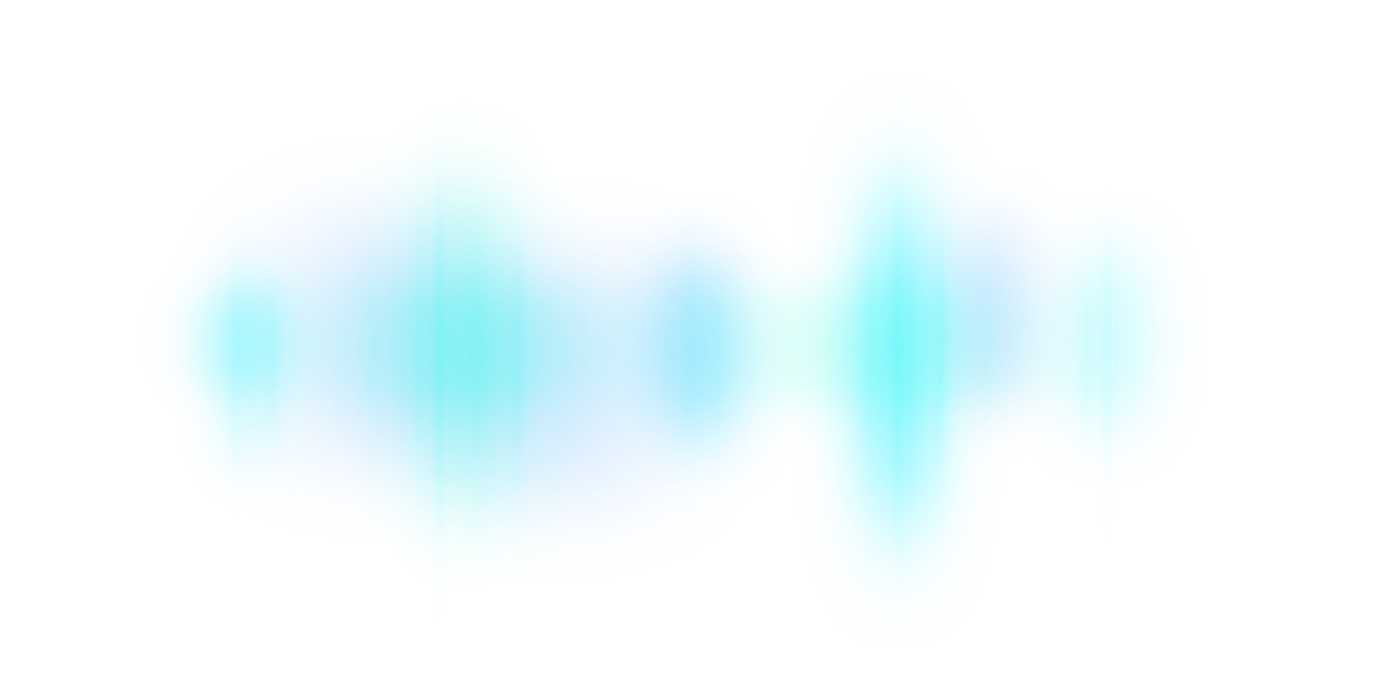
Our illustration is a subtle northern light, representing our Nordic origin.
Powerpoint


Misuse
Our template is all dark, with the exception of one white slide.
→ Use dark slides for our own content
→ Use white slide for screenshots and content from other sources (e.g SAP slides, customer slides)


→ Empty template
→ Example deck including tips & tricks
→ Up to date and offical presentation to present Pearl to any audience (coming soon..)
The password to this file can be found here
Word
Word Document for technical content and user instructions.
Word Document for white papers, one pagers, general content.
Personal Assets
Assets to LinkedIn, Teams and E-mail for extra branding of your personal profiles.
→ LinkedIn banner for personal profile
→ Teams background images
→ E-mail signature
Examples.


Apps & Interfaces


Prints


Changelog.
23.10.25 - Update Teams background images
18.09.25 - Updated template pptx
12.05.25 - Updated example pptx
08.05.25 - Added Social media section
24.04.25 - First draft
Pearl Group © 2025